
B2B Data Visualization: The Art of Integrating Mobile-First Charts
Published September 18, 2026 by David
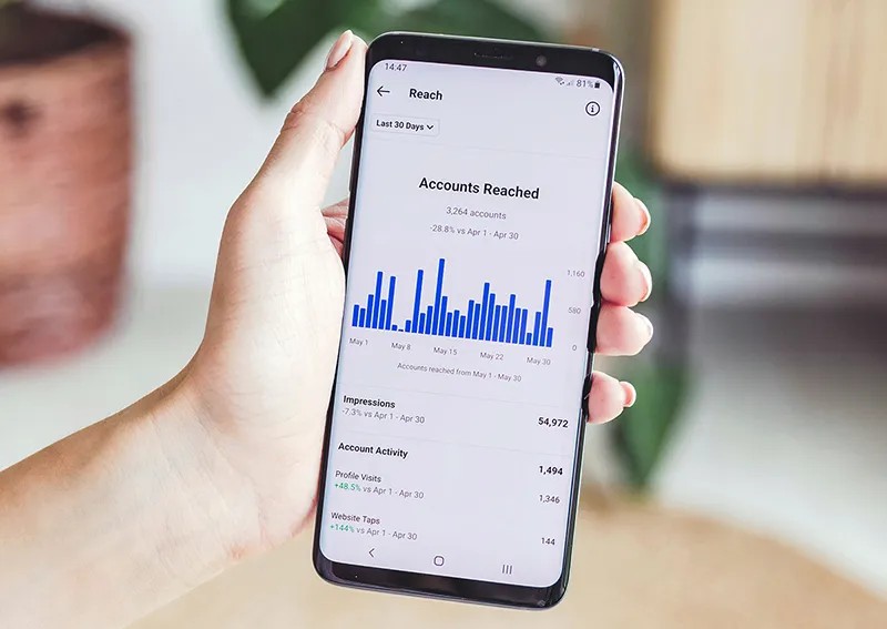
I test my numbers on mobile before publishing. Period.
A prospect scrolling on their phone won’t zoom in on your Excel screenshot. They’ll scroll. If your visual doesn’t land in 3 seconds, you lose their attention. And their business.
90% of carousels are unreadable on smartphones

The golden rule? One number per visual.
If you dump a chart with 12 months of data, 3 axes, and an illegible legend, you’ve failed. A B2B decision-maker’s brain doesn’t have time. They want:
- “45% more leads in 6 months” (single number, bold, clear).
- Not the full history since 2018.
That’s why cognitive simplification works. Three values max per slide. Otherwise, your message drowns.
One chart = one idea.
Not three. Not five. One.
CarouselCraft’s AI intentionally limits infographics to 3 data points per slide
Avoid flat images like the plague.
Exporting your pie chart from Canva as a JPG? Fonts blur, colors shift. Result: your slide looks amateur.
The fix?
- Generate visuals in vector format (or via code).
- Auto-adjust them to screen size.
- Keep pro-level clarity on mobile and desktop.
Let AI do the heavy lifting.
Spending 20 minutes aligning progress bars? Your hourly rate deserves better.
- Input your 3 key numbers in the editor.
- Let AI convert them into ultra-readable gauges or bars.
- Generate in one click via Studio.
Your time is valuable. Spend it selling—not tweaking charts.
Les illustrations de ce blog sont généreusement mises à disposition par les photographes d' Unsplash.