
How to Create a High-Performing Carousel That Works on Both LinkedIn and Instagram
Published June 3, 2026 by David
I love the idea of a carousel that performs on LinkedIn and Instagram without overcomplicating things. The problem? 9 out of 10 times, we fail because we repurpose LinkedIn-heavy content (too much text, too dense) for Instagram—and it crashes instantly.
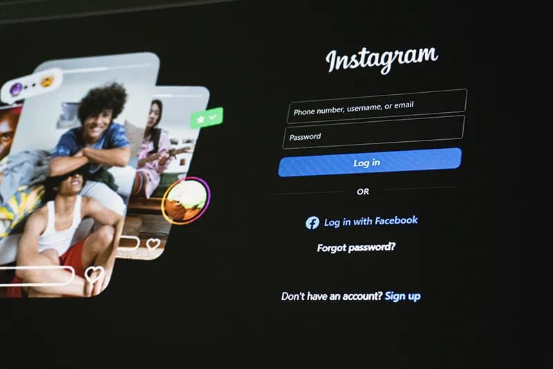
No need to start from scratch. The solution? The Hybrid Format. One design, two platforms, zero frustration.
1. Start with Instagram (Even If Your Goal Is LinkedIn)
Instagram is the ultimate design filter. If your visuals don’t work there, they won’t work anywhere. LinkedIn is more forgiving—it’ll even tolerate text-heavy slides.
- Your priority: A clean, minimalist design with bold visuals that perform on Instagram.
- The bonus: That same design will look polished on LinkedIn. People there are tired of slides that look like annual reports.
2. Layer Your Text (The Game-Changer)
LinkedIn craves depth. Instagram demands speed. How do you satisfy both?
- On the slides: One punchy sentence per image. No paragraphs, no bullet points. Just a hook that grabs attention. Less is more.
- In the caption: Expand as much as you want. Lists, arguments, context. LinkedIn readers will dive in. Instagram users will swipe. Everyone wins.
One Tool to Rule Them All
Creating a carousel that follows these rules without wasting hours is a pain. Unless you use CarouselCraft.
It enforces:
- Safe margins (no cut-off text).
- A text limit per slide (no walls of words).
- A ready-to-publish output for every platform.
👉 Switch to Studio and design your first hybrid carousel in 3 minutes flat!
Les illustrations de ce blog sont généreusement mises à disposition par les photographes d' Unsplash.