
Visual Accessibility: How to Ensure Everyone Can Read Your Carousel (Without Squinting)
Published June 17, 2026 by David
Color blindness isn’t just a "guy thing." 1 in 12 men and 1 in 200 women are affected. If you’re throwing colors together haphazardly on LinkedIn, you’re losing 10% of your male audience before they even read your headline.
But accessibility isn’t just about color blindness. Try reading a carousel on your smartphone in bright sunlight with minimum brightness. If your colors blend together or lack contrast, your reader swipes away. Engagement gone.
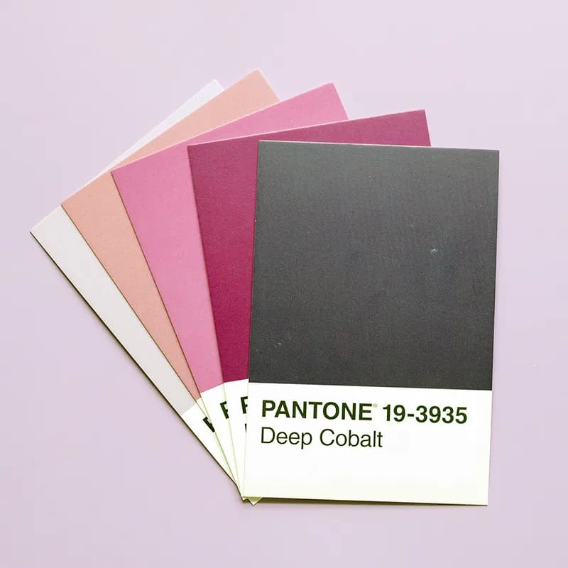
To maintain a high Swipe Rate and—more importantly—respect your audience, accessibility must be your priority. Here are 3 no-nonsense rules for carousels that work for everyone.
1. The Contrast Test (WCAG Rules)
WCAG standards require a contrast ratio of at least 4.5:1 for normal text and 3:1 for large headlines.
For your carousels:
- Avoid at all costs: Light gray text on white, or mustard yellow on sky blue. It’s unreadable and strains the eyes.
- The fix: Dark text (charcoal gray or navy blue) on white/cream backgrounds. Prefer dark mode? Use off-white or very light gray text on dark backgrounds.
2. Don’t Rely Solely on Color
The classic trap: green for positive, red for negative. Except if your reader is color blind (the most common case), they won’t see any difference.
The fix: Add a "safety net." Pair color with a symbol—an upward arrow for green, downward for red. Or use "+" and "-". Don’t let color do all the work.

3. Ultra-Thin Fonts Are the Enemy
Ultra-thin fonts (Ultra-Light, Thin) look great on your 4K Mac. But on your prospect’s scratched smartphone, squinting in the subway with sunlight glare? Those tiny letters vanish.
Play it safe: Always use Regular or Medium weight for your main text.
Inclusive Design Without the Hassle
Checking contrast for every line on every slide is tedious. Ignoring it? You’re losing dozens of prospects.
That’s why we built CarouselCraft. The tool includes palettes and themes that natively comply with accessibility standards. AI blocks unreadable combinations. You focus on your message—CarouselCraft handles the rest. Everyone reads you effortlessly.
👉 Protect your content’s readability—switch to Studio today!
Les illustrations de ce blog sont généreusement mises à disposition par les photographes d' Unsplash.